With 2024 set to come to a close, Jaguar has made good on its earlier promises — and revealed the first official teasers of its new brand identity ahead of its official re-launch. As part of the larger Reimagine strategy of Jaguar Land Rover, the brand had earlier laid out plans to do so by 2025.
While no official images of cars (or concept cars) are being shown off as yet, Jaguar is pointing us towards four core symbols of change that nonetheless provide a clear indication of the British carmaker’s new aesthetic direction.
Jaguar’s new device mark blends upper and lowercase characters seamlessly, and is defined by its modern geometric form, symmetry, and simplicity
Intended to capture the overarching ethos of Copy Nothing, these are held together by the brand’s new Exuberant Modernism creative philosophy, which is said to embrace “bold designs” and “unexpected and original thinking”.
The first of the four symbols is the brand’s new device mark — defined by its geometric form, symmetry and simplicity. In contrast to the all-caps, strong typeface we’ve known from the Jaguar brand for a while now, this new visual feels immediately different with its blending of upper and lowercase characters, and of course, feels more modern than before.
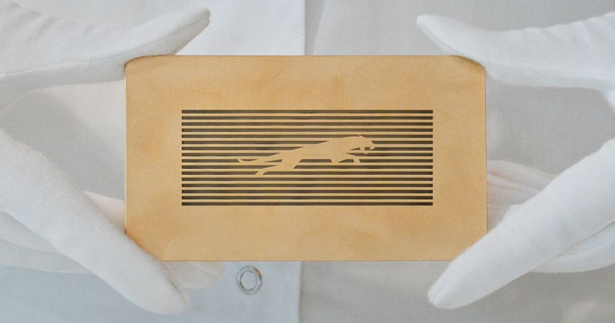
Complementing this is a second symbol Jaguar is calling the Strikethrough — in essence, a bold linear graphic that you’ll see on yet another symbol: The brand’s new maker’s mark.
The new maker’s mark doesn’t abandon the brand’s iconic ‘leaper’ — although this has clearly been incorporated within the new principles of the re-imagined brand language

Longtime fans should be glad to note that the re-imagined Jaguar brand isn’t abandoning its iconic ‘leaper’, but has instead incorporated it within the new brand language. Jaguar states that the monogram is meant to function as a “code for expression” and a “signifier of a completed work”, to be used as a flourish or finishing touch.
Finally, you’ll note that the last of the four symbols, Exuberant Colours, bears direct relation to the brand’s new creative philosophy.
Instead of quiet luxury, it appears the brand will stay to the course of boldness as mentioned. It’s stated that the primary colours of yellow, red and blue will form the tonal building blocks, and that this pointed use of colour isn’t just rooted in the brand’s values, but will also reinforce its association with art.

It’s worth remembering that Jaguar’s ‘Copy Nothing’ ethos is actually deeply embedded within its history; the term stems from the belief of its founder, Sir William Lyons, that “A Jaguar should be a copy of nothing”.
In turn, the brand states that its re-imagination now is also intended to recapture what the Jaguar essence is. While it’s thus clear so far that Jaguar has its eyes locked on the future, it’s also hoping to return to the values that made it an iconic name.
As for what’s set to come next, Jaguar will take this very ‘Copy Nothing’ ethos right into the heart of Miami at the Miami Art Week on 3 December 2024.
There, it will unveil its first Design Vision Concept car — which should give the world a clearer indication of the design language to be borne by the first production cars under the re-launched brand.
In line with its commitment to art, Jaguar has also teased collaborations with “new and groundbreaking emerging artists who share its ethos of Copy Nothing”, through a multitude of gallery spaces over two as-yet undisclosed locations.
Speaking on the news, Rawdon Glover, Managing Director of Jaguar, shared, “Jaguar was always at its best when challenging convention… This is a complete reset. Jaguar is transformed to reclaim its originality and inspire a new generation.”
[[nid:709793]]
This article was first published in sgCarMart.
Read the full article here

![THIS popular TV star to enter the show as Andhkasur? [Exclusive]](https://mediadailyfile.com/wp-content/uploads/2024/11/Shiv-Shakti_-Tap-Tyag-Tandav-1-300x211.jpg)


